
Spreetail Unified Catalog
- 31siloed item tools merged into one catalog
- 4 wksfeature-flagged beta with real users
- 9people on a cross-functional team
Overview
Spreetail's merchants, content specialists, and channel operations teams spend their days managing the items Spreetail sells across Amazon, Walmart, eBay, and other channels. The goal of this project was to create a unified Catalog feature that let them accomplish their many item-related tasks with fewer tools. I worked alongside another product designer, three product managers, and four developers, with merchants, content specialists, and channel operations as our core stakeholders.
The Challenge
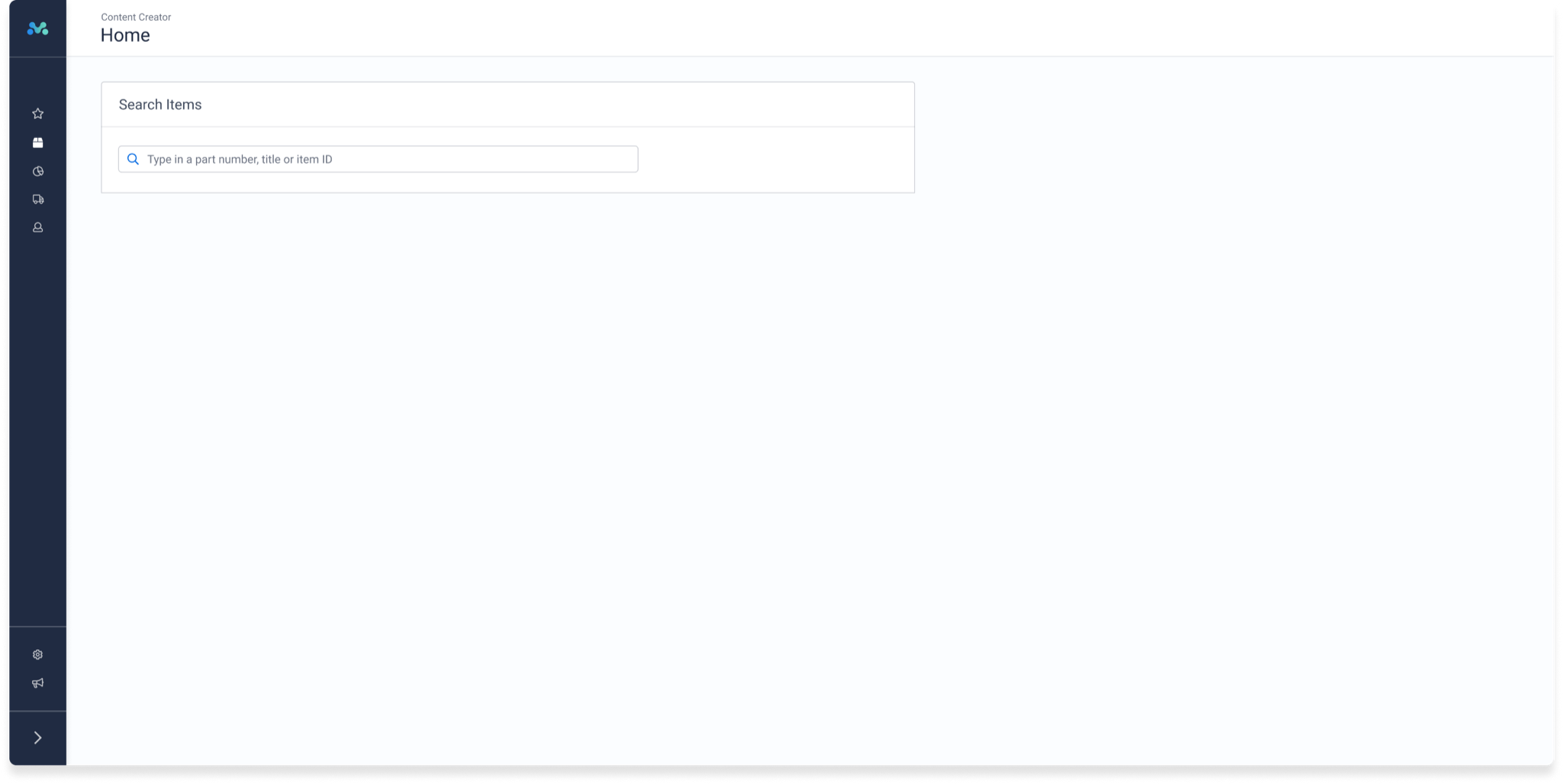
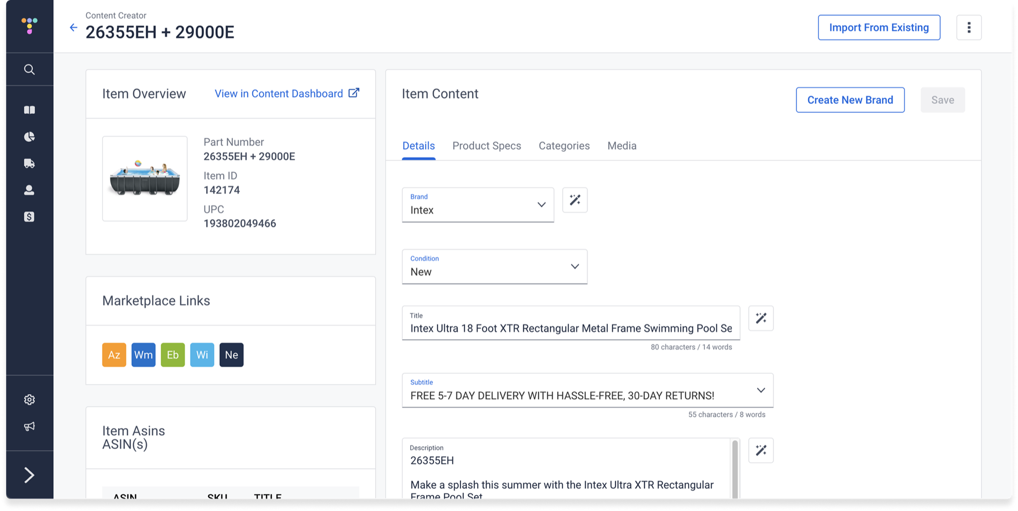
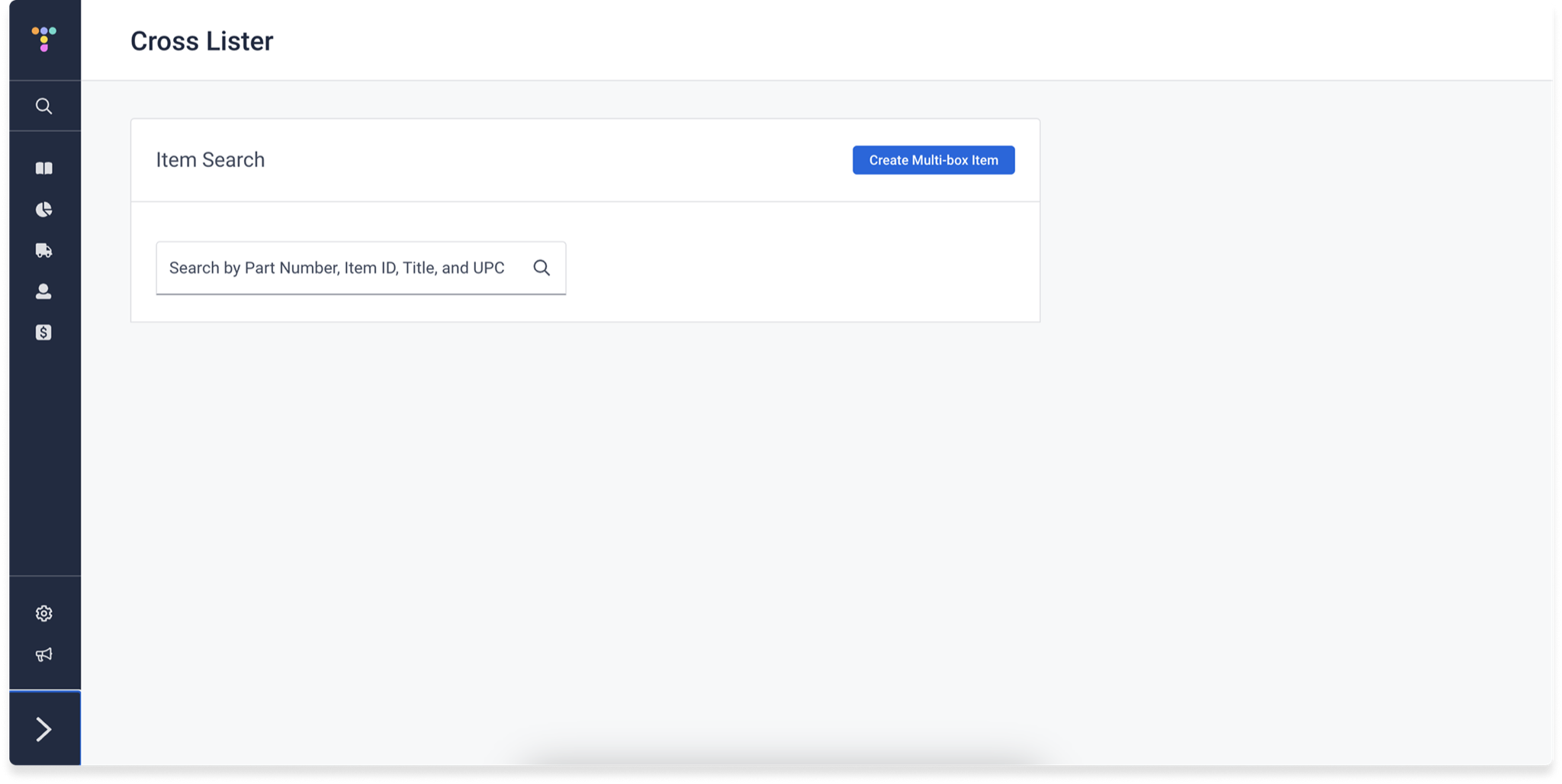
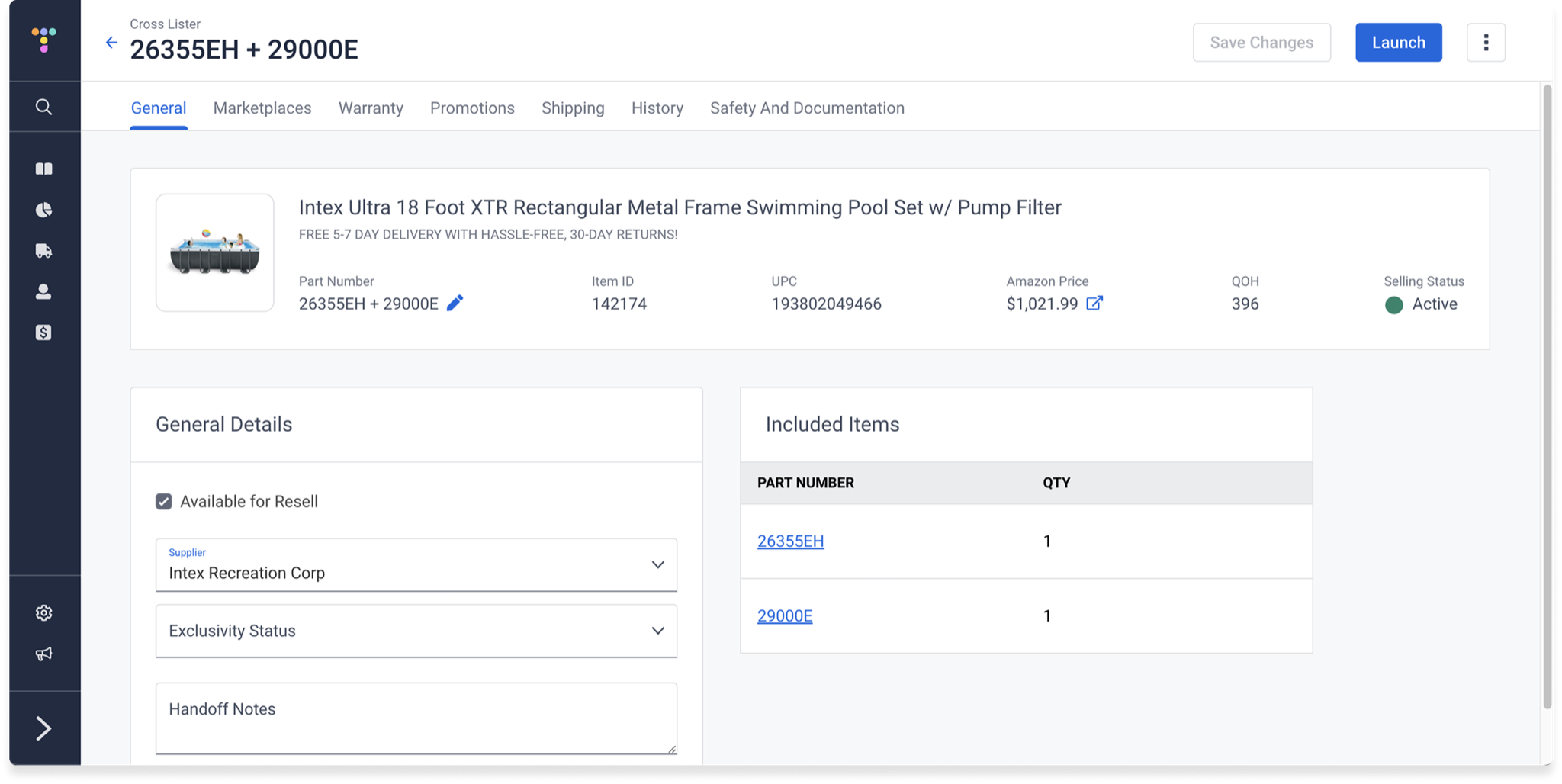
The existing Catalog experience was split across three separate features—Content Creator, Cross Lister, and Item Master—each with its own entry point, and each duplicating content and item details:
- Built in silos: Each tool had been built independently of the others, and many parts were still on an outdated version of the design system.
- Conflicting data: The same content details could be edited in several places, which led to inconsistencies across channels.
- Constant context-switching: Completing certain tasks meant jumping between apps that often weren't connected to each other.
- Hard to learn: With so much overlap between the three tools, new users struggled to figure out which one they were supposed to use for a given task.
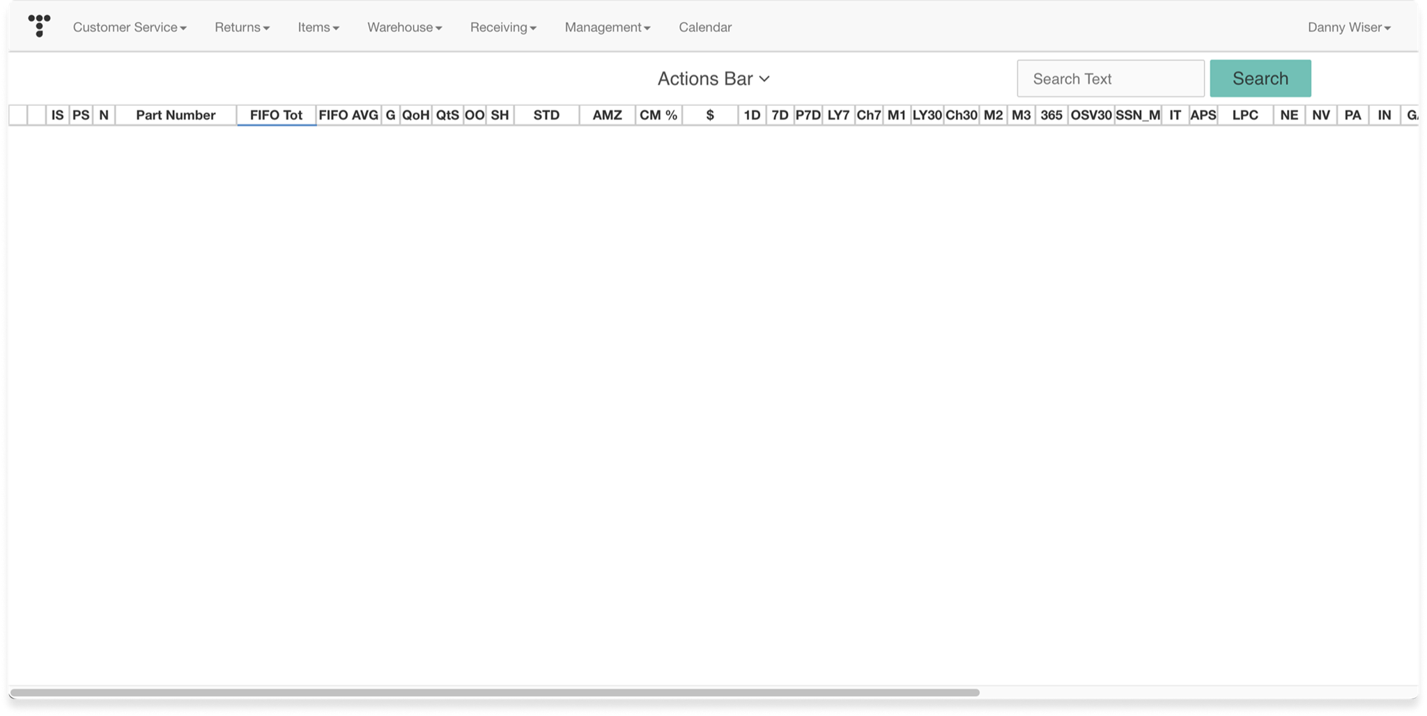
Before: Three Tools, One Item
Each tool started from its own search screen, and once you found an item, each showed a different slice of the same record. Content Creator and Cross Lister both displayed the part number, item ID, and UPC, and both let users edit item details, while Item Master offered a dense spreadsheet of inventory data with its own search.
Research
Because the three tools served overlapping but different teams, we needed to understand how each group actually moved through their work before deciding what "unified" should mean. We ran stakeholder interviews with merchants, content specialists, and channel operations, used card sorting to understand how users grouped item information, and sent out surveys to reach a wider set of users. We then built user flows collaboratively with stakeholders, so the people doing the work could see—and correct—how we were modeling it.
The Solution
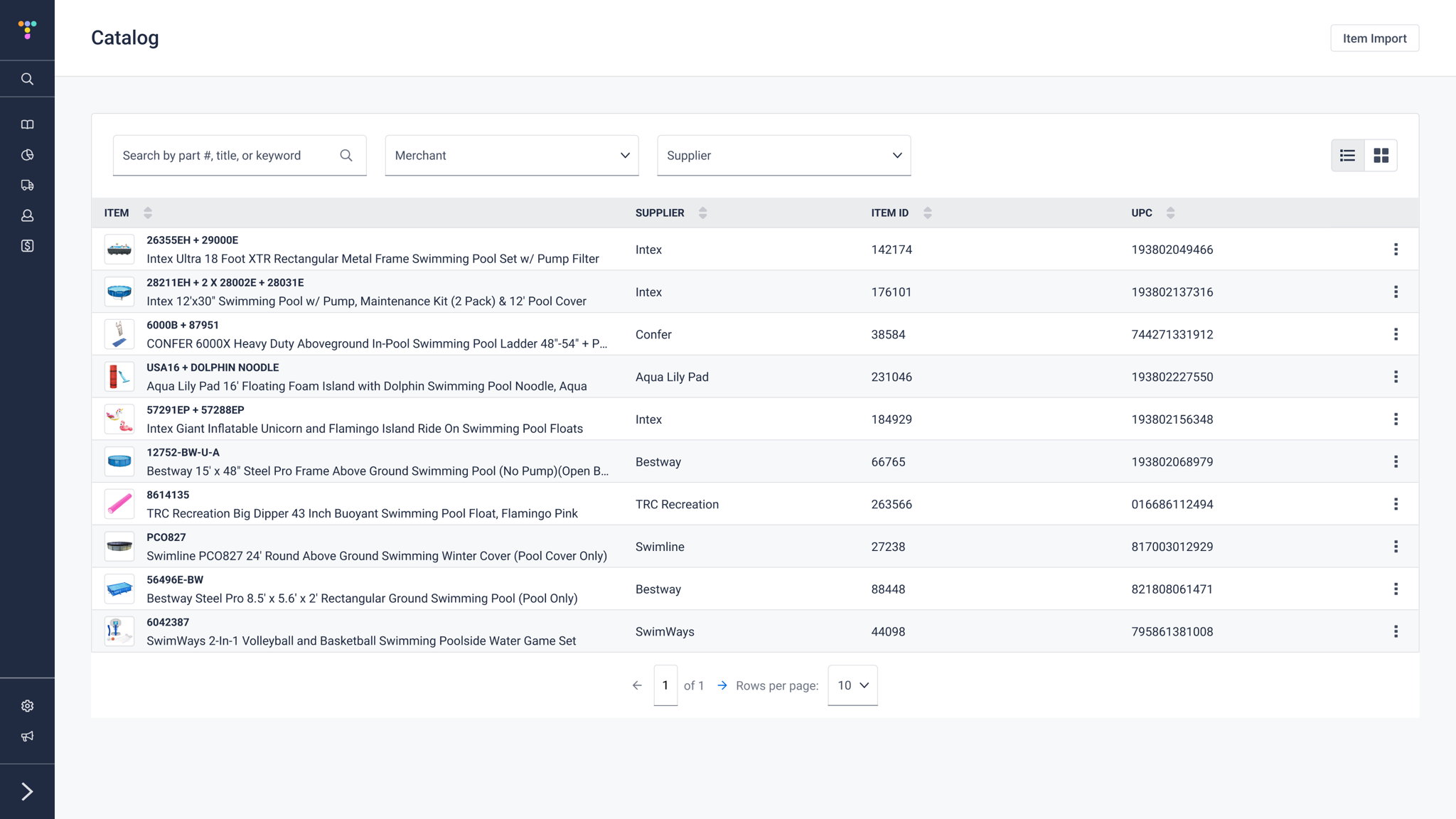
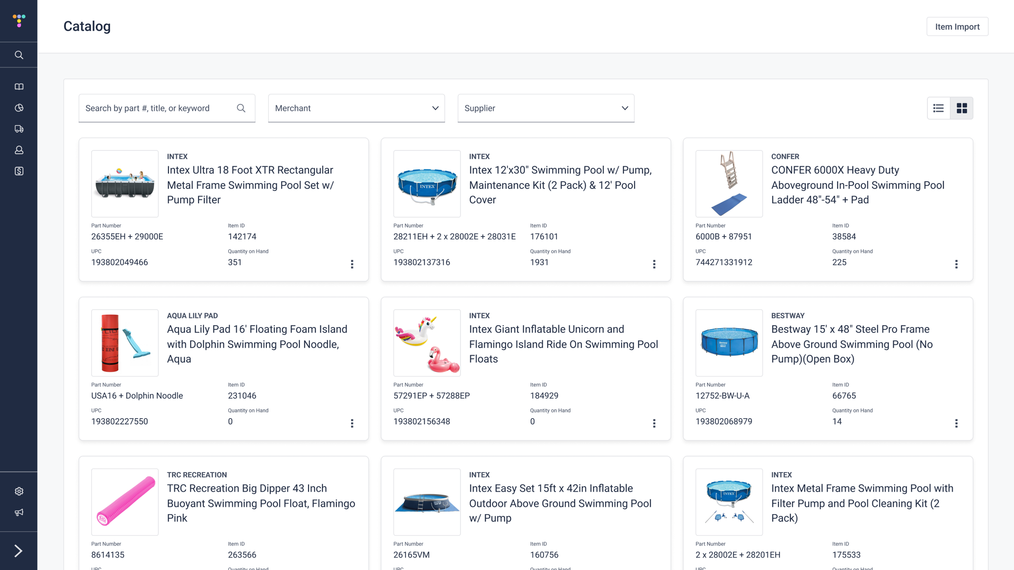
We replaced the three entry points with a single Catalog. Users start from one list of items they can search by part number, title, or keyword and filter by merchant or supplier, and can switch between a dense list view and a more visual grid view depending on the task.
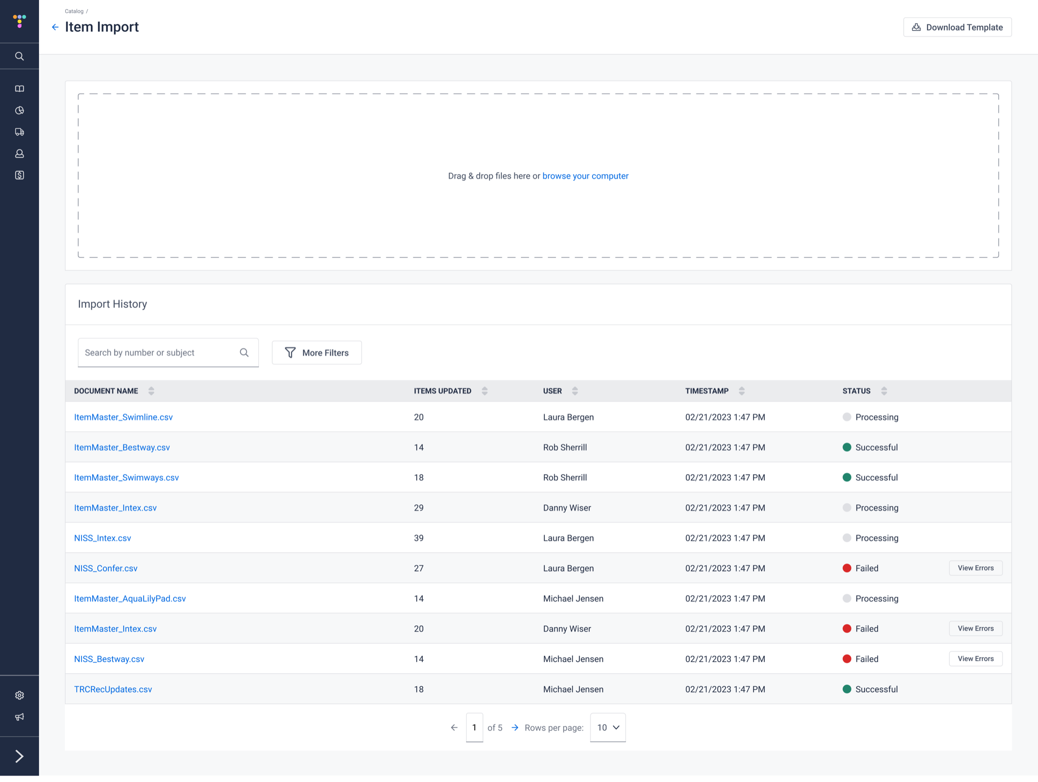
Bulk updates moved into the Catalog too. Item Import lets users download a template, drag and drop a spreadsheet, and track every import in a shared history, with clear processing, success, and failure states and a direct path to view errors.
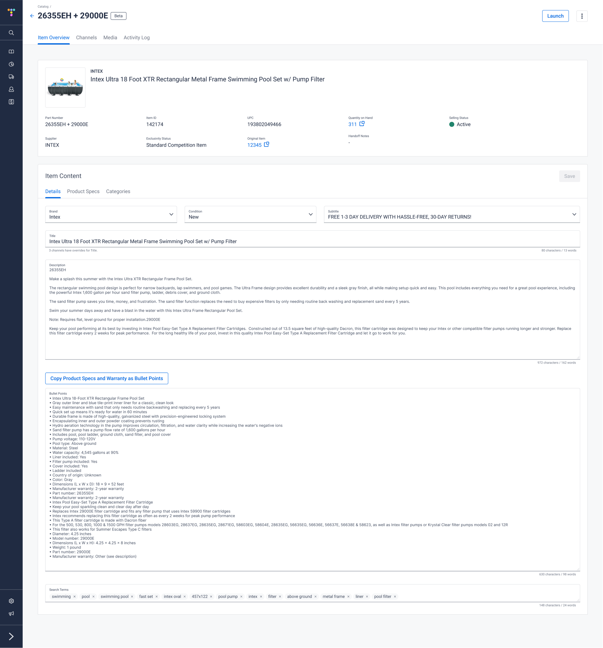
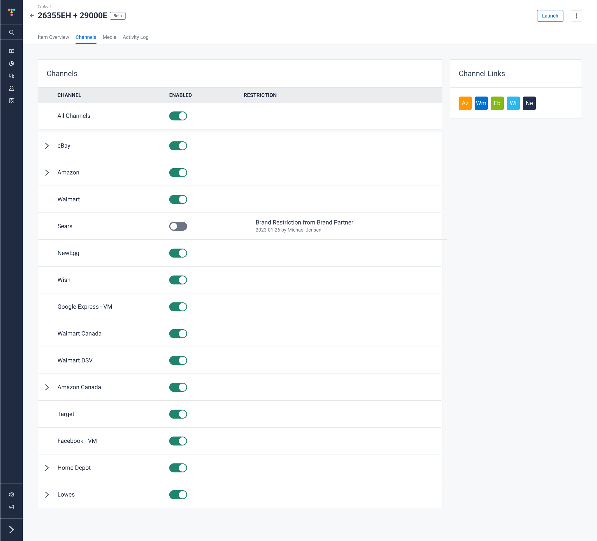
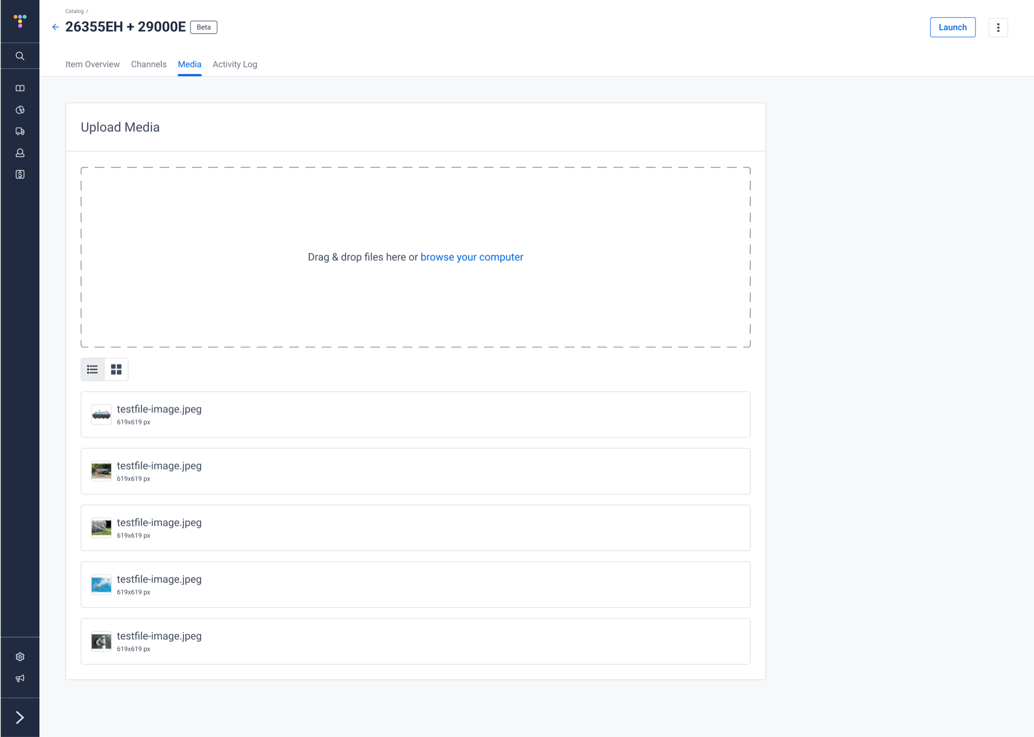
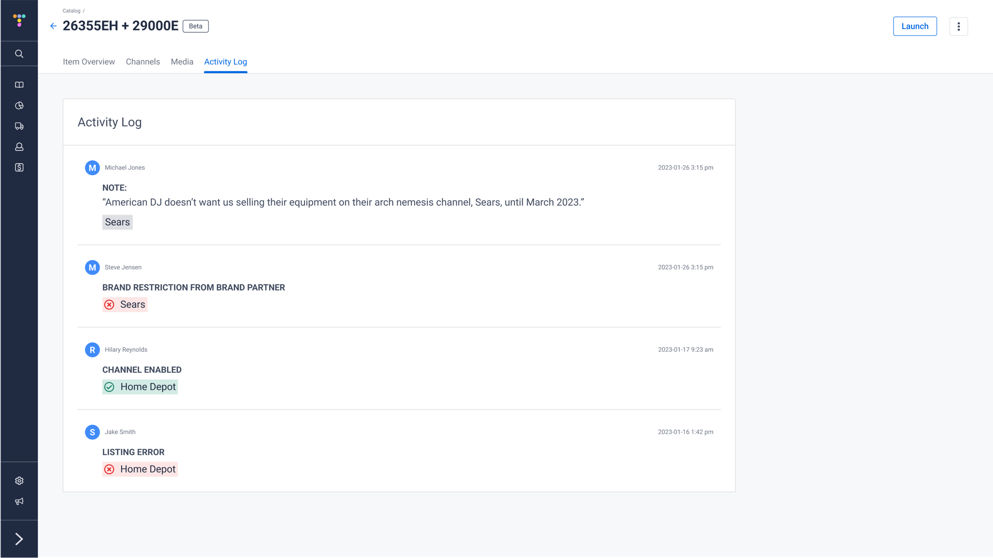
Selecting an item opens one item page that brings together everything that used to be scattered across the three tools, organized into four tabs:
- Item Overview: Part number, item ID, UPC, supplier, quantity on hand, and selling status in a single summary, above one Item Content section for the title, description, bullet points, product specs, categories, and search terms. It flags when a field has channel-specific overrides, shows character and word counts on every field, and copies product specs and warranty info as bullet points in one click.
- Channels: Every sales channel in one list, each with its own toggle. When an item is restricted from a channel, the reason and who set it are shown right next to the toggle.
- Media: Drag-and-drop image uploads with list and grid views.
- Activity Log: A running history of notes, restrictions, enabled channels, and listing errors, so anyone picking up an item can see what happened and why.
Rollout & Results
Before the full release, we put a beta version of the feature in front of a small group of content specialists and merchants behind a feature flag. The beta ran for roughly four weeks and let us find and iron out issues and make tweaks based on real use. Once the feature was ready, we worked with those beta stakeholders to build training materials for everyone else.
- A "one-stop shop": Users were thrilled to have a single place to complete all of their item-related tasks.
- Efficiency gains: Teams saw noticeable efficiency gains once they no longer had to bounce between three tools.
- A model for the platform: The project's success kicked off work to unify several other parts of the app the same way.
Reflections
The hardest part of consolidating tools isn't the screens—it's earning trust from three teams who each had a workflow that worked well enough for them. Bringing stakeholders into the user flows early, and then into a feature-flagged beta, meant the final design reflected how people actually worked instead of how we assumed they did, and it gave us built-in champions to help train everyone else at launch.