
NFM Design System
- ~2 wks~2 daystime to polish a mockup
- XDFigmaall design work moved to one shared tool
Overview
Nebraska Furniture Mart (NFM) sells furniture, appliances, and electronics in its stores and online. At the time, design work lived in Adobe XD and there was no shared design system behind it. I helped NFM establish one: moving all design work from XD to Figma, building a library of tokenized styles and reusable components, and using it to put better design patterns into the product.
The Challenge
Without a shared system, the same pieces of the site were redrawn file by file. Each designer's version of a button, a product tile, or a heading drifted a little from the last, and every new mockup started with rebuilding parts that already existed somewhere else. That slowed designers down and made consistency depend on memory instead of the tools.
Moving From XD to Figma
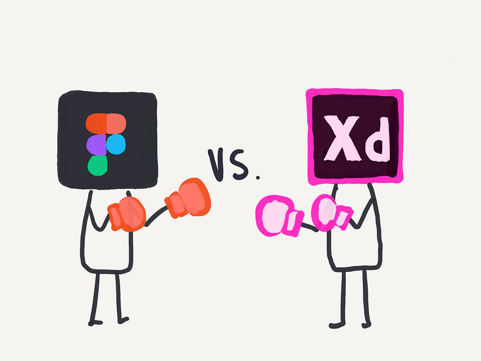
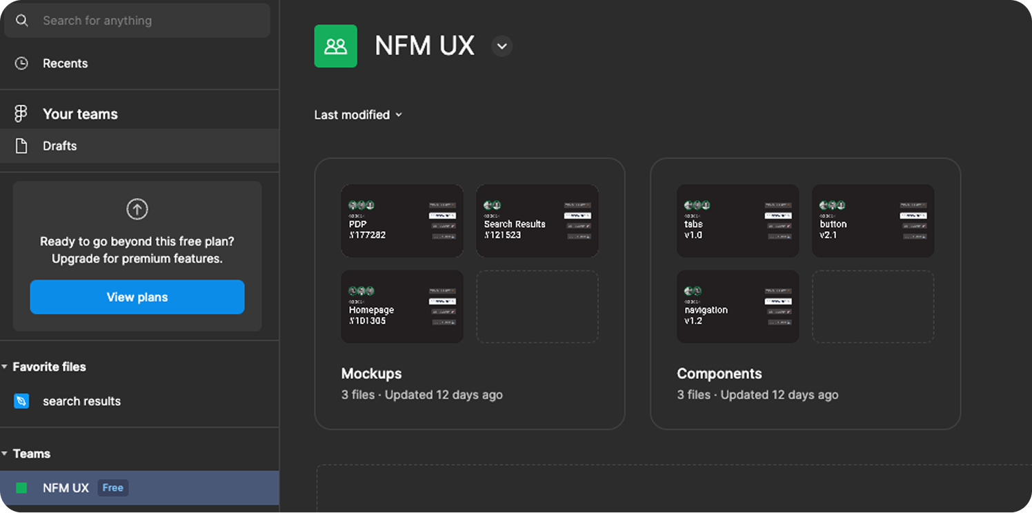
I made the case for moving the team to Figma and then led the move, migrating all design work out of XD. Everything now lived in one shared NFM UX team space, split into Mockups for page designs like the homepage, search results, and product detail pages, and Components for the shared library. Each component file carried a version number and status cover, so designers could see at a glance what was current.
Tokenized Foundations
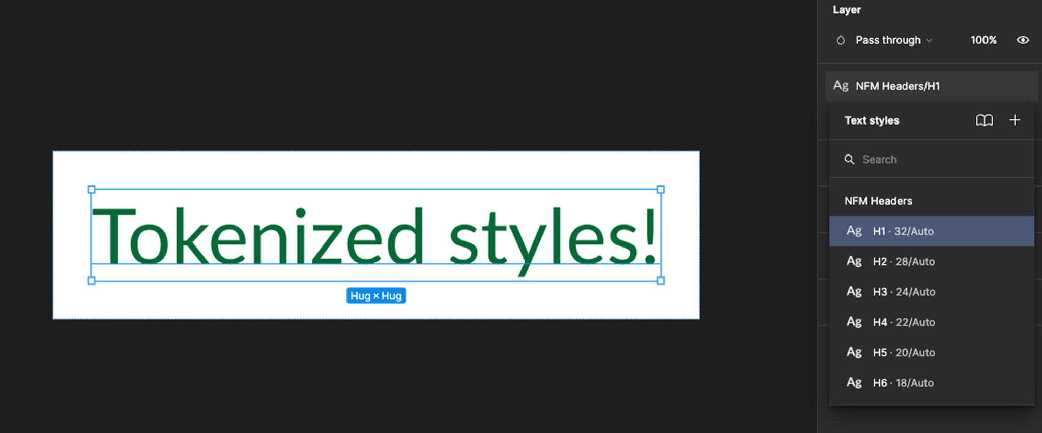
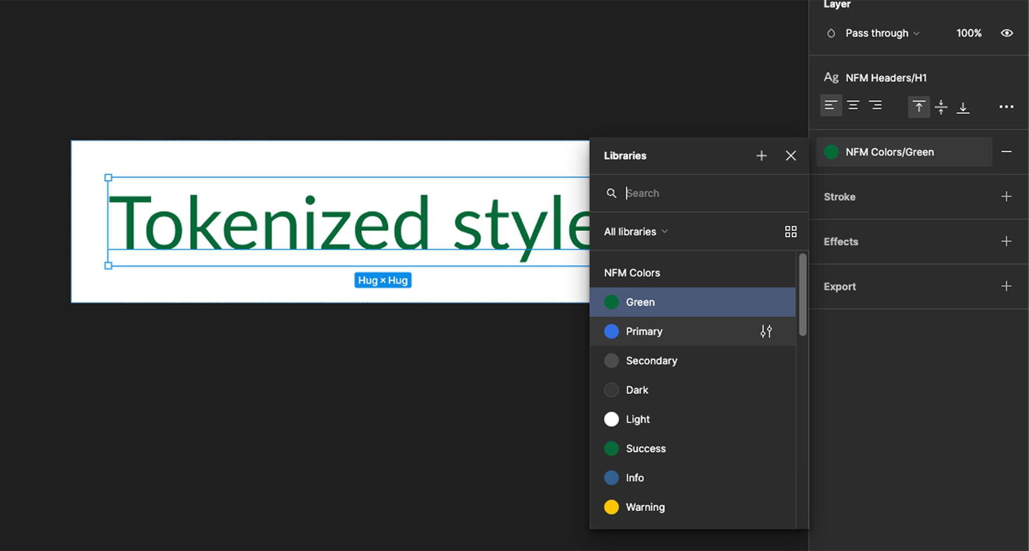
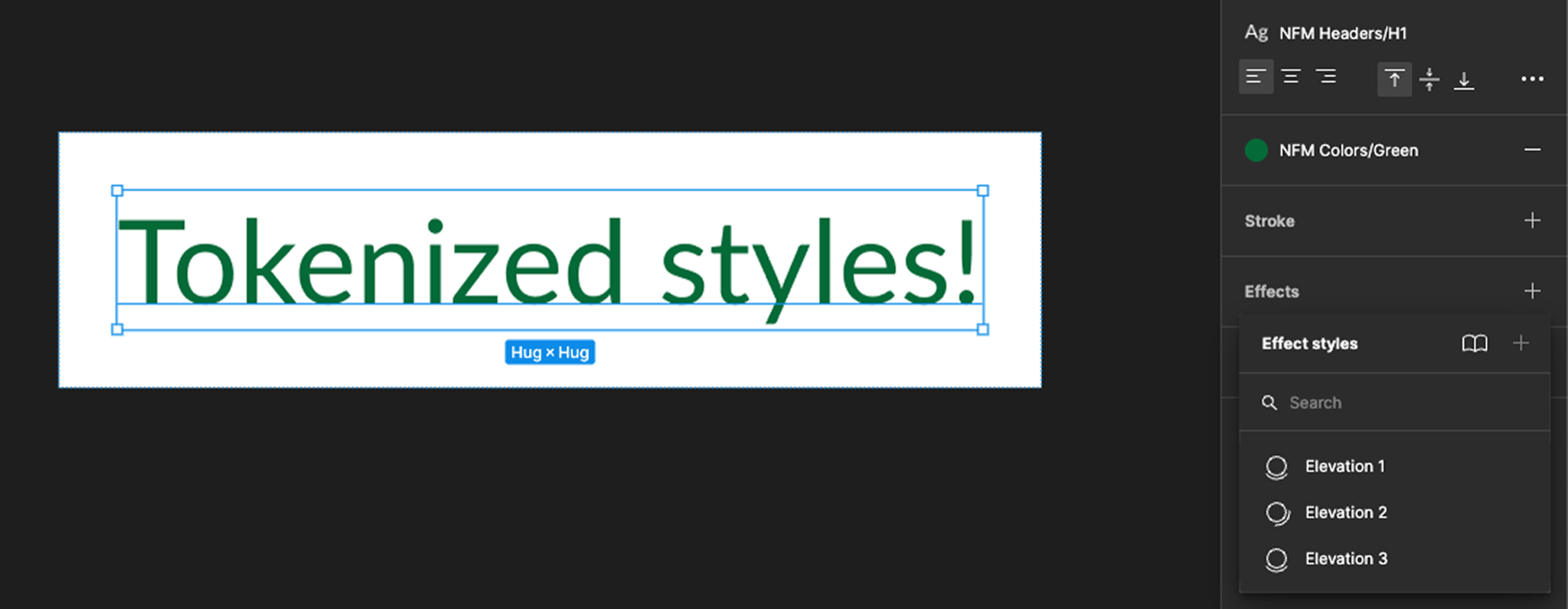
The system started with shared styles instead of one-off values. Headings H1 through H6, the NFM color palette, and three levels of elevation were all published as Figma styles, so applying the right type, color, or shadow became a single click from the library rather than something to look up and type in.
Flexible Components
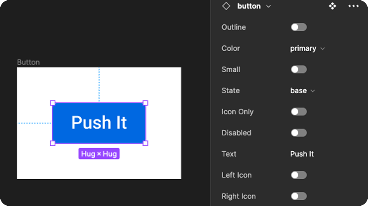
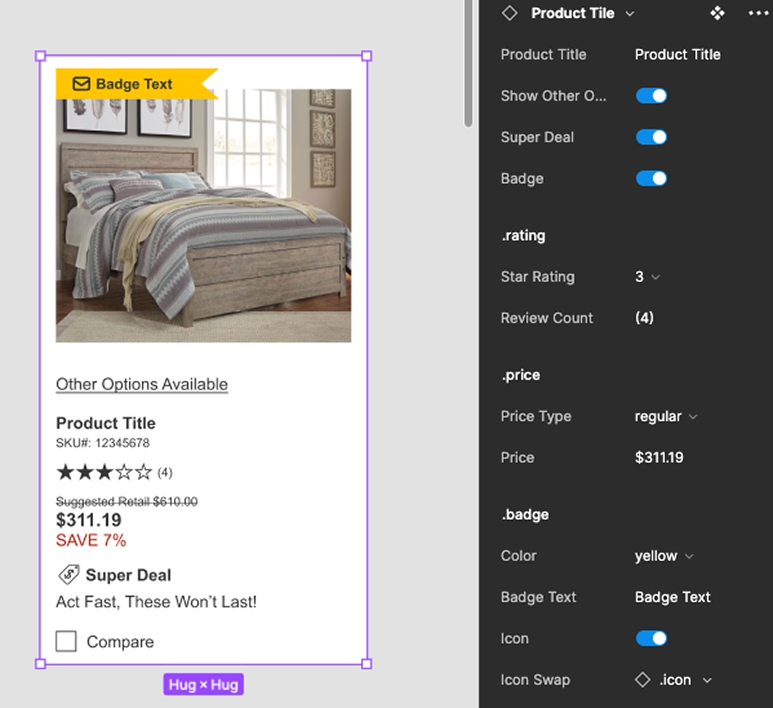
On top of those styles, I built components with properties, so one component could cover every variation instead of a separate copy for each. The button handles outline, color, size, state, icon-only, disabled, and left or right icons from a single panel. Larger components were assembled from smaller ones: the product tile combines nested rating, price, and badge components, with toggles for options like Super Deal, badges, and "Other Options Available".
Better Patterns: The Action Bar
With the system in place, we used it to clean up patterns on the live site. One example is the action bar, the header that sits on every page. The redesign:
- Gave every utility link an icon and a consistent style, instead of a mix of underlined and plain text.
- Turned Products and Services into clear menu buttons next to a wider search field.
- Simplified account and cart into labeled icons, with the cart count shown in plain text.
- Split promotions into their own rows, so free shipping and financing offers no longer competed for the same strip.


Outcomes
- One tool, one source of truth: All design work moved from XD to Figma, in a single shared team space.
- Designer efficiency: Polishing a mockup went from about two weeks to about two days, because designers assembled screens from the library instead of rebuilding parts.
- Stronger brand patterns and accessibility: An outside UX consultant hired by NFM found the site used brand design patterns more consistently and was more accessible after the work.